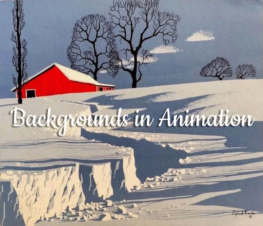
Background Art with Illustrative Qualities
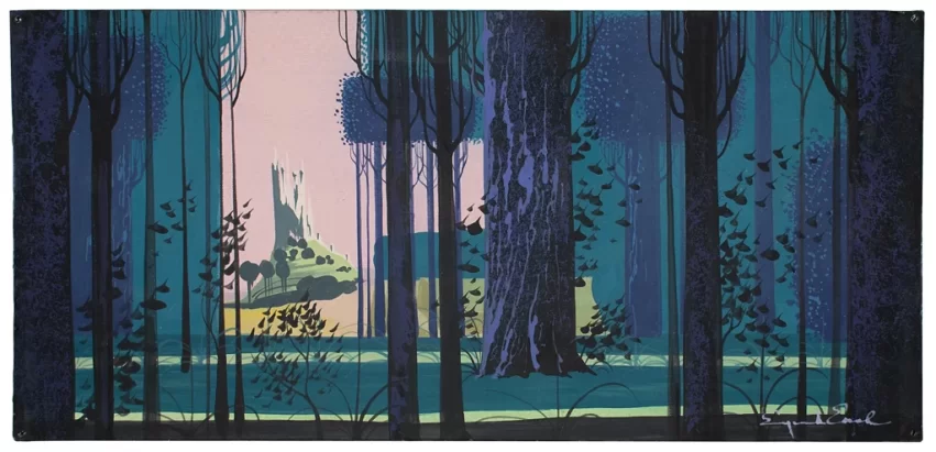
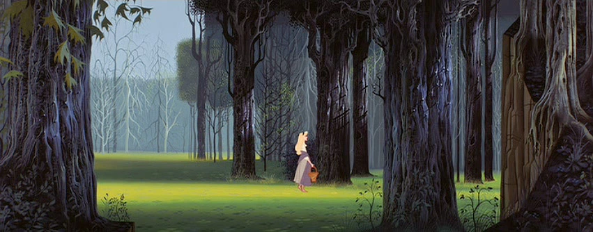
One of my favorite background artists is Eyvind Earle. I first encountered Eyvind Earle’s Background Art when I was very young, through the backgrounds of Disney’s “Sleeping Beauty.” Earle worked there as the color stylist and concept artist for this classic animated film (1959) and his work amazed me! His style is unique, magical, and epic, crafting worlds that I would love to visit. Additionally, his backgrounds have a distinct “dark” quality that I am really fond of ! I believe the aesthetics of his art have definitely shaped and formed my own aesthetics. These deep, dark, magical forests with their intricate details and delicate color palettes were the perfect setting for Sleeping Beauty’s enchanting tale.
How Eyvind Earle’s Background Art Break the Rules
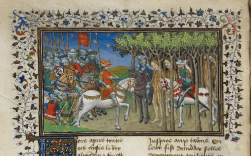
As I mentioned in a previous post about background art, typically backgrounds in animation are often expected to be created quickly, with artists usually foregoing details not only for cost efficiency reasons but also to ensure the characters stand out. However, Eyvind Earle’s backgrounds are an exception to this rule. His pieces are heavily detailed, and each background most certainly took significant time to complete. His backgrounds possess qualities usually found in illustrations and strongly remind me of medieval illustrations, with their “flat” and “static” perspective and intricate details.
But what makes these backgrounds so effective despite their abundance of details? I think there are two main reasons:
The stylized elements
First of all, the elements of the BG are carefully stylized into geometrical shapes, creating a harmonious composition with a somewhat static layout (the medieval era, by the way, was often described as “static”). Here, the coloring techniques in Earle’s backgrounds play an important role: we don’t see brushstrokes or gradients; instead, we observe various shapes in opaque colors forming objects. This kind of stylized “detailed simplicity” ensures that the background art completely supports the characters’ path of action.
The color
Earle’s muted color palette plays a crucial role, adhering to the principle of “close tones.” In “Sleeping Beauty,” you won’t find vibrant and pure colors or high contrasts. Instead, Earle keeps the colors somewhat in the saturated part of the rainbow and, sometimes, his palette is monochromatic. This approach brings to life the atmosphere of medieval castles, with their dark corridors and deep forests where—everybody knows—magical creatures like fairies, witches, and dragons lived. The only vivid color palette, with almost pure colors, is seen inside the castle. Here, characters with equally vivid and pure colors stand out, such as the two kings.
With his amazing work, Earle set the tone for “Sleeping Beauty,” making Disney’s animation a true work of art. His backgrounds are not merely complementary to the animation; they are art in their own right.
Watch the Video
Watch the video below to see Eyvind Earle painting a BG for Disney’s Sleeping Beauty. He is using acrylics, and the “layered” technique. You can find this video at The Art of Animation Facebook Group and you can learn more about Eyvind Earle’s Background Art and his incredible work on his official website.
Cheers,
Ersi
Interested in learning more about background art for 2d animation?
Check out our other posts : Tips on Background Art in 2D Animation !
What are your thoughts on the background art in Sleeping Beauty ? Share your comments below!
If you enjoyed this post, spread the word! 🌟
Share this with post to: